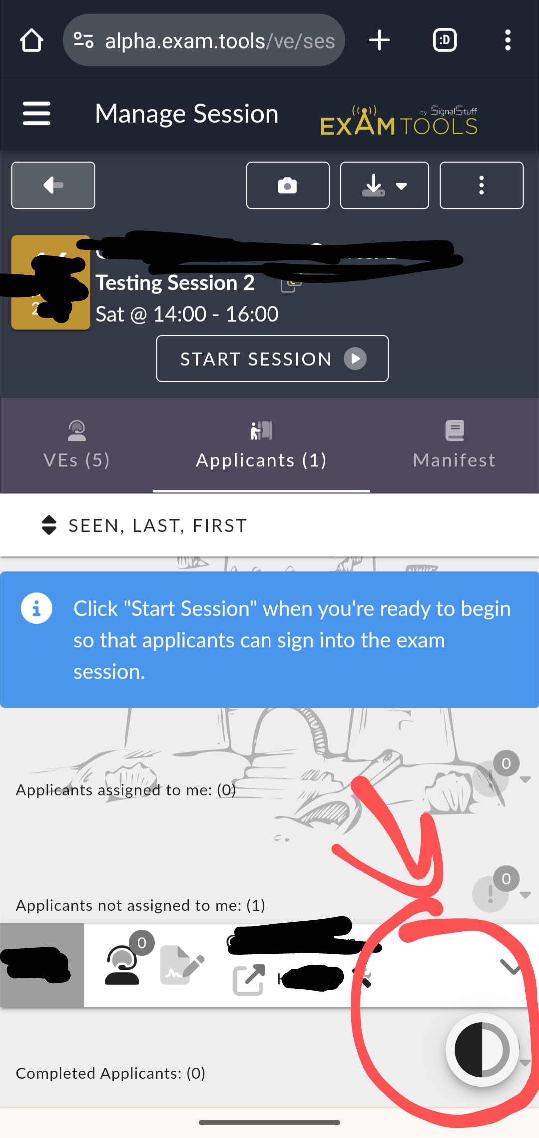
Move the dark mode selection button
15
votes
The dark mode selection button often blocks portions of the screen since it's a persistent UI feature on the bottom right. Especially in mobile, it often gets in the way of the items on the screen.
Maybe move this option to a menu item on the left or put it into the profile screen. I don't believe toggling light/dark mode is something done with such a frequency that it warrants being on every screen? I usually assume people set it once to their preference and don't change it after that point.
Comments: 1
Oldest
•
Newest
•
Most likes
•
Fewest likes
-
15 Mar, '24
Marcel AI6MSHighlighted comment
Somewhat related https://features.examtools.org/suggestions/135972/move-the-lightdark-mode-green-cookie-bar-i-understand-buttons-to-the-left-side